
Careful what you see and believe.
COVID-19 virus. Image from Center for Disease Controll (CDC), modified by author.
In my work as a professional engineer, as an environmental researcher, and now as the director of the oldest independent climate science education organization in the world, I understand graphs. This is why I was concerned a few days ago when I saw a log (logarithmic) scale graph of confirmed COVID-19 cases on MSNBC. It looked like the top of the curve we have heard endlessly about was here, that the peak was at hand and we would soon be free of the curse of the exiles. The state of this disease today is that we may be peaking; please Great Spirit, let it be so. But presentation of a graph with a log scale to the public without explanation of what a log scale is, does not represent reality.
A logarithmic scale or a “log” scale graph is a tool many professionals and science workers use to visualize data that is similar to a normal “linear” scale graph in one way, but radically different in another. The “log” graph below is what I am talking about, presented on MSNBC April 13 (and updated to April 19 for this article). Compare the first graph (log scale) to the second linear scale graph. They are the same graph using the same data on the web same page. The first is with the log scale, the second with the linear scale. The skyrocketing red United States line in the linear scale graph is the same as the apparently curving line in the log scale graph, only presented without the exaggeration of the logarithmic scale.
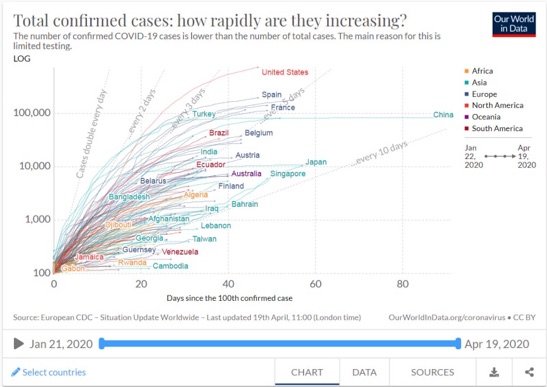
Log scale graph of total confirmed COVID-19 cases from Our World In Data (OWID.) The vertical log scale axis on the left is greatly exaggerated to allow visualization of very small numbers as well as very large numbers. OWID clearly cautions that the total number of confirmed cases is lower than the total number of cases because of lack of testing, and that U.S. data has inconsistent units — the only one of the major countries identified that confuses their information with non-standardized data. (Image from World in Data COVID-19 Confirmed Cases Log.
With both the log scale and linear scale graphs, the time line along the bottom axis of the graph is the same; one increment on the graph per one day.
In the image above with the label “Log” above the number of confirmed cases, the vertical axis does not increase at a steady rate, it increases at a logarithmic rate, which is: every larger increment is 10 times greater than the previous increment. This is quite useful if one remains absolutely clear that what one is looking at is a log scale. It allows very large data to be visualized alongside very small data, but a log scale badly skews the meaning of data if this “log” function is not understood.
The graph below is the same graph as the one above, only with the “Log” scale switched to “Linear” scale. (Check it out – go to the graph, and click on “Log” scale label, top left, to change it to “Linear.”)
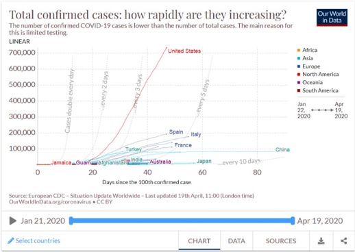
This is the same graph as the first graph, only with “Log” scale switched to “Linear.” The linear scale represents data one to one and now it is easy to see the dangerous exaggeration of a log scale presented to the uninitiated. (link to graph) There are 65 more graphs at OWID, scroll down from the previous link to see a list. Most of them are changeable from “log” to “linear” scale. Image from World in Data COVID-19 Confirmed Cases Linear.
To the log scale unaware, the extremeness of the pandemic in a log scale graph appears dangerously less than it actually is. Deaths in the U.S. reported April 18 by OWID were 3,770 — exceeding for the second time the 2,997 deaths in the September 11, 2001, attack on the World Trade Center. The first time was April 16 with 4,928 deaths in the U.S.
This is a “novel” disease. This means it’s new. It’s a recent mutation, or simply a never before seen virus from bats, or? The academic publishing roulette continues. Broadly, this virus matches closest to those found in bats and pangolins, but it’s not close enough to be from current day animals. (See here, here, here, here, and here.) It is definitively not a bioengineered or genetically-modified organism. The place of origin has been widely reported as Wuhan, China, but the first reported case in December 2019, was not in Wuhan and had no connection to the later cases. A third of the first 41 cases had no contacts with the seafood market in Wuhan where the disease reportedly was first found.
The ultimate origin of COVID-19 remains unclear in academia at this time. The virus responsible for a similar coronavirus outbreak identified as severe acute respiratory syndrome (SARS) in 2002 was just discovered in 2017.
It’s entirely possible that our ever-increasing use of natural resources and resulting environmental degradation has increased risks of disease in animal populations from stress. It is certain that our increased human population crowding around these now sicker animals increases the risk of zoonotic (animal to human) disease transmission. But there may be other sources.
Permafrost thaw and collapse is reanimating untold volumes of preserved and living microbiology that can survive millions of years in a deeply frozen state. Multiple nthrax outbreaks in Siberia that killed one to two million reindeer in the late nineteenth and early twentieth century have been blamed on reanimation of frozen anthrax from permafrost from the eighteenth, fifteenth, and thirteenth centuries. (See here and here.) Survival of microbiology in permafrost is so robust that there are even implications for the possibility of living viruses in space. More troubling is the astonishing volume of permafrost collapse.
A paper by Natali et al., in the most prestigious journal in the world, Nature, on November 19 last year found that permafrost collapse is so extreme already that frozen lands across the Northern Hemisphere are emitting more greenhouse gases than they are storing. From 2003 to 2017, permafrost collapse emitted 2.3 gigatons of greenhouse gases on average every year. But because permafrost was likely stable and storing carbon in 2003, and we know for certain permafrost thaw collapse is increasing, emissions today are realistically greater than the average cited of 2.3 gigatons per year, possibly approaching total annual emissions from transportation (5 gigatons) or from energy generation (9 gigatons.)
There are 9 million square miles of permafrost or 5.8 billion acres, and it can be thousands of feet deep storing organic material in suspended animation for a million years. The total for the U.S., including Alaska, is 2.4 billion acres. The collapse of permafrost is so severe and unexpected it is happening 70 years ahead of projections. Hundreds of millions to billions of acres are thawing today, right now.
Humans have no resistance to this virus, wherever it came from. For every 20 COVID-19 cases confirmed by testing in the U.S., one of those infected people die. Our scientists do not yet have a clear idea of how many people have the disease because of lack of testing. They do not know the extent to which people who do not show symptoms are infecting others.
Please do not go out in public unless it is absolutely necessary and then wear a mask whether you are having symptoms or not. Diligently review strategies for decontaminating yourself and the things you bring home if you have to go out and get supplies or for a mental health break. Use curbside pickup at every possibly time. Everyone, young people especially — just because young people survive more does not mitigate one death per 20 infected persons. Treat this disease like it was from outer space. We have no resistance. Be safe. The life you save may not be yours, it may be someone you love.
[Bruce Melton, a longtime contributor to The Rag Blog and guest on Rag Radio, is a professional engineer, environmental researcher, filmmaker, author and CEO of the Climate Change Now Initiative in Austin, Texas, the oldest, independent climate science education organization in the world founded in 2005. The Climate Change Now Initiative is a nonprofit outreach organization reporting the latest discoveries in climate science in plain English, using global warming psychology to communicate this new science on the right side of the brain. The Initiative’s science reporting, films, music, and images of climate impacts happening now can be found at ClimateDiscovery.org.]
- Read more articles by Bruce Melton on The Rag Blog.
- Listen to Thorne Dreyer’s Rag Radio interviews with Bruce Melton.


